According to a study, 82% of wine consumers base their purchasing decision on the appearance of the bottle and its label. This highlights the unique need for wineries to design and produce labels that can convey the quality of their product while simultaneously capturing consumers' attention in just a few seconds.
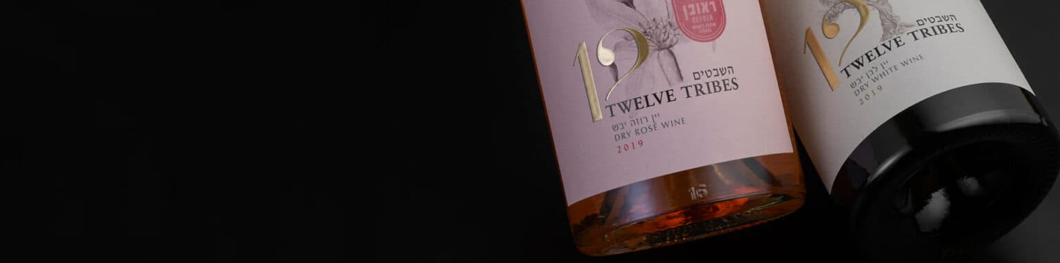
For wine label design, the most crucial aspect is that its aesthetics reflect the brand's values. This can be achieved through the use of various colors, typographies, and images. These elements serve as direct bridges to the potential connections consumers can form with brands. Therefore, if the goal is to sell wine to experienced wine consumers, it's recommended to lean more towards a quality-focused aesthetic, creating a more traditional label.
For consumers, labels with a poor color choice, careless spelling, generic text, illegible font, etc., will almost always leave a negative impression, leading them to deduce that the product's content will be of the same quality as the label.
ETIQUETA 001
ETIQUETA 002
ETIQUETA 003
It's important to mention that the performance of a good label isn't limited simply to its beauty, but also to its durability in the environment where the bottle will live. Factors like cold, humidity, and ice in manufacturing and storage areas are performance catalysts that must be considered when producing labels. Ensuring the use of a label material that won't slip off the wine bottle or develop blisters upon its first contact with moisture is of utmost importance when designing a label to attract consumers.
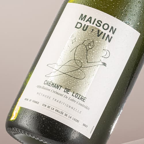
ETIQUETA 001
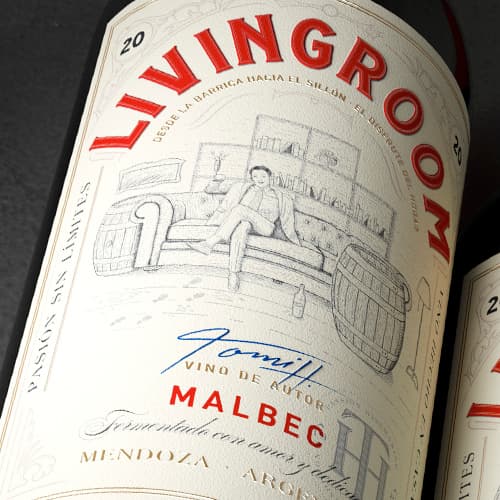
ETIQUETA 002
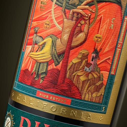
ETIQUETA 003


